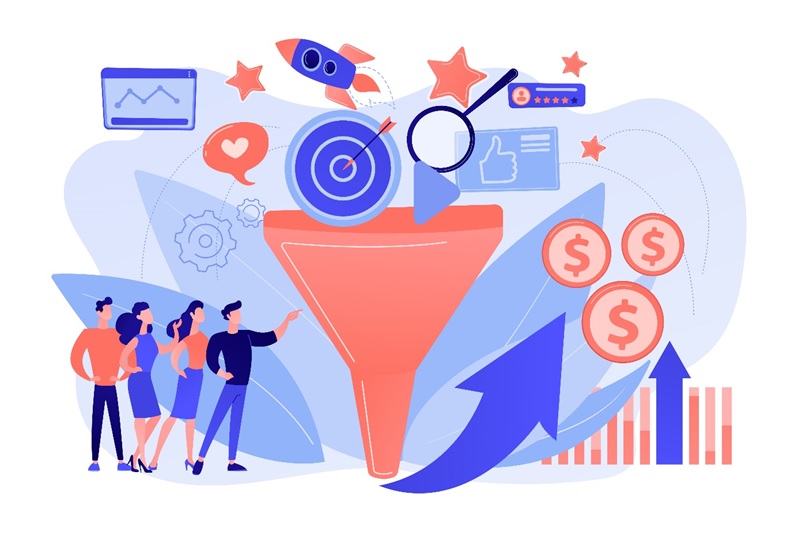
Driving Traffic That Converts: Strategies for Boosting Website Engagement and Conversions
What is the most important page on your website?
No, it’s not the homepage, although the homepage plays a key role in creating a memorable first impression. The winner here is an underdog – your product page(s).
It makes perfect sense when you think about it. Much of your email, SEO, social media, and paid advertising efforts are aimed at driving traffic not to your website, but to specific product pages. That’s where the actual decision-making and buying happen.
However, on average only 2.5-3% of website visits lead to successful conversions. However, this varies by industry. Poor design and optimization of product pages are usually responsible for such low conversion rates.
This post will discuss what makes a well-designed product page and why each strategy works. Continue reading to discover more and elevate your product page design by learning the implementation of each strategy.
Let’s get started!
The easy and intuitive customization process
Providing personalized experiences and meeting customer needs has become a non-negotiable aspect of running a successful business, as evidenced by research indicating that brands that excel at personalization generate 40% more revenue than their counterparts that lag. The same research further demonstrates that 71% of customers anticipate companies offering personalized interactions. Personalization has become an essential element of any successful product site.
Although customization is easier to achieve online, you need to be careful not to overburden your potential customers. Choice paralysis is a real thing, and it occurs when people are presented with several different options.
According to the Hick law, the more choices someone has, the longer it takes to make a decision. This delay can cause potential customers to abandon a purchase, which in turn hurts sales.
How can you reduce this choice paralysis?
Here are some tips:
- Limit the number of choices you have, or at least highlight some of the most unique ones. At any time, you can add a “More” button, which will display other, less popular choices.
- Simplify the personalization process and make it easy for people to customize the product they like.
- Offer default, predefined options based on popular picks and bestsellers. This reduces the decision fatigue for some customers.
- It’s all about making the whole process as user-friendly as possible and helping customers have a say in the final product.
Diversify your product gallery
One of the biggest barriers to online shopping is that customers can’t touch, feel, try, and experience products. These factors can also hurt sales after purchase, as they are responsible for 10-15% of products purchased online being returned. This figure is even higher in some industries, such as fashion, reaching 50%.
While engaging all the senses is still the preserve of brick-and-mortar stores, you can use the next best thing – a diverse product gallery.
-
Provide as many images as you need
Showcase your product from different angles and close-ups to help your customers visualize it. Use only high-quality images, but ensure they are optimized to not slow down your site.
Grainy or pixelated images will only hinder your conversion rate as they don’t show your products properly, so they don’t add any value. Such a mistake will negatively affect your customers’ perception of your products and also harm your reputation. Remember that visual appeal is a crucial factor for trust and credibility, which means that your site visitors will be reluctant to give you their credit card numbers if your product pages look dodgy.
-
Offer a 360-degree product view
The 360-degree view feature replaces a physical store visit by allowing shoppers to move the product around and see it from different angles.
In addition, introducing this UX element allows you to upload fewer images without sacrificing the user experience.
-
Enable the zoom function
When shoppers browse products in a physical store, they always want to examine the details carefully.
The zoom feature mimics this and allows site visitors to better understand the product and see its texture. By being able to explore the product in such detail, potential customers can feel more confident in their decision to buy.
-
Show your products in action
Contextualize each product by showing potential customers how others use it.
This will allow them to experience what a product looks like in real life and how to use it. For example, it is much more gripping and appealing to show a garment on a model than on a flat surface.
Photos taken in context give customers a better idea of the fit of the garment.
It is a good idea to feature models of different sizes and ethnic backgrounds to create an emotional connection with all segments of the audience.
-
Leverage video
88% of people say that watching a product video has convinced them to make a purchase.
This format is particularly powerful in its ability to compress a lot of information in a short period. We’ve already mentioned the problem of short attention spans, and rather than forcing your potential customers to read about the features and benefits of your product, it’s much more effective to present it all in a short video.
-
Show the size of the product in real life
When shopping online, size matters.
If you don’t want to mislead your potential customers, make sure they can imagine how big or small a product is. List all the sizes of both the product and the packaging, and for clothes and shoes, add a size chart.
If there is only a small chance that the size of the product could be misleading, show the scale and place the product next to objects that can be used as a reference point.
Take advantage of price anchoring
Marketing relies heavily on human psychology. Pricing is no different and you can use several strategies to increase conversion rates.
Buyers have no idea how much a product should cost and form an opinion on whether a price is right based on several reference points. For example, they look at what a similar product costs and use that as a benchmark.
Furthermore, if a product is in high demand, people will be willing to pay more.
This valuation mechanism, therefore, indicates that customers’ perception of price is as follows:
- Relative
- Sensitive to manipulation
Use visually striking CTAs
Your conversion rate can be significantly boosted by a compelling call to action. That’s why this is the second post in this article.
Although creating a short phrase on a button-shaped element may appear straightforward, the procedure demands extensive research, data analysis, and A/B testing. The recipe for an irresistible CTA is combining the right text, size, color, and space.
Create action-oriented copy
The point of a CTA is to tell your visitors what they need to do and inspire them to take action.
But instead of saying “Buy”, your wording needs to be more persuasive. Phrases such as “Find out more”, “Yes, I’d like a free trial”, “Ask for a discount” or “Enter my exclusive offer” are much more attention-grabbing and powerful.
Choose the right size
On the one hand, you want the CTA text to be readable, but on the other hand, you don’t want a giant button that looks cheap and obnoxious.
The right balance would be to make the button large enough to stand out but not overwhelm the rest of the page.
Final thoughts
Well-thought-out and optimized product pages will result in significantly more conversions. When a customer reaches a product page, it usually means they are ready to buy and it is your job to facilitate the checkout process and make it as smooth and seamless as possible. These strategies will point you in the right direction and guide you through the process of optimizing critical product-side elements.